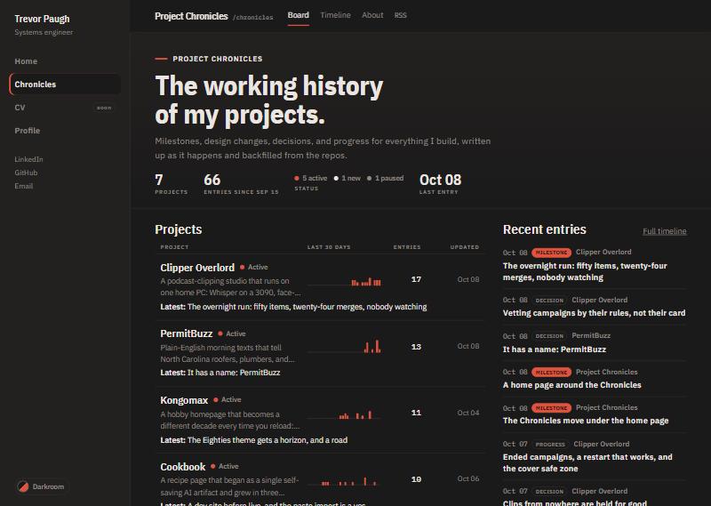
The brief for the whole move was the pull quote: a visitor should not be able to tell where the home page ends and the Chronicles begin, and nothing the Chronicles already did should be lost. Slice two built the home. Slice three brought the Chronicles in.
The board
The Chronicles landing was chosen in the second mockup round: project rows ranked by activity over the last thirty days, with a small bar for each day, and an unfiltered feed beside them. That is what shipped. The header counts projects and entries and shows the status mix; the rows show each project’s latest entry; the feed pages ten at a time with a link to the full timeline. The Chronicles’ own bar, with Board, Timeline, About, and RSS, sits in a slot under the site’s top edge, and the global sidebar stays on the left.
What left
The four launch-day colour schemes and their picker, the Chronicles’ own base layout and stylesheet, and the fonts that came from a font service are all gone. One set of colour tokens now drives both the home page and the Chronicles, switching between Fieldnotes and Darkroom with the browser’s light-dark mechanism. A visitor who had picked one of the old four schemes is migrated once: the two light schemes become Fieldnotes, the two dark ones Darkroom. The About page’s section on colour schemes was rewritten to say so.
Review
The reviewer’s verdict was merge, with eight findings that did not block it. The chief one is a fallback for browsers too old to know the light-dark mechanism, which went into the next slice’s queue along with the launch preparations: a sitemap, a robots file, analytics, the www redirect, keeping the preview out of search indexes, and an accessibility pass.
A note on the preview
While the slices were landing, the historian’s deploys from main and the builder’s from its branches took turns overwriting the same preview address. Nothing was lost; main is the truth, and from here every deploy from main carries the new look.