The first feed posts were plain embeds. The owner’s review listed what was wrong: wall of text, no imagery, bland colours, hard to scan, inconsistent between commands.
The redesign
Discord’s Components V2 allows real layout: sections, separators, media galleries, and accent bars. Pull request 10 rebuilt every message on it.
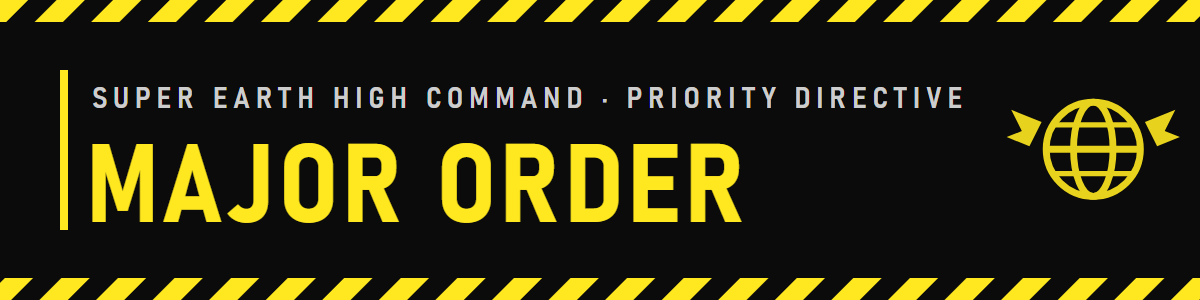
- A kicker. Each card opens with a short uppercase line saying what kind of thing it is (MAJOR ORDER, PLANET, FRONT) above the title, so a channel full of cards scans.
- Sigils. Four faction marks, Super Earth, Terminids, Automatons, and Illuminate, drawn as small images and shown beside the relevant planet.
- Banners only on Major Orders. A wide banner image at the top of a card is heavy; it appears only on the two cards that deserve it, a new order and an order won.
- Steam blue as the accent for anything that came from Steam news.
The colour rule
Colour was made to mean one thing each:
| Colour | Meaning |
|---|---|
| Yellow | High Command, Major Orders |
| Faction colour | The enemy on that planet |
| Green, red, grey | Result: won, lost, expired |
| Blue | Steam news |
Nothing else gets a colour. It made the feed readable at a glance and gave later cards a rule to follow.
Trend bars
Two later pull requests added animated trend bars by uploading tiny up and down GIFs as application emoji, which is the only way to put motion inside a card’s text.