
The persona is specific on purpose: a 55-year-old roofer, reading glasses in the truck, setting this up on a phone between jobs.
The rules that fell out of that
- 18-pixel body text. Larger than the web default, so nothing needs the glasses.
- 48-pixel tap targets. Every button and control is at least that tall, so a thumb hits it the first time.
- Atkinson Hyperlegible. A typeface designed for low vision, with letterforms that stay distinct at small sizes and in bright light.
- One decision per screen. Pick a trade. Next screen, pick an area. Next screen, pick how to be told. No long forms.
- Alerts read back as sentences. When an alert is set up, the screen says it in words: “Roofing permits within 10 miles of your address, every morning by email.” If the sentence is wrong, the setup is wrong.
The map that was removed
The first builder mockup let people draw an area on a map. In review it was slow on a phone, hard to do with a thumb, and produced shapes nobody could describe. It was replaced with “within X miles of an address,” which is a sentence a roofer would say. The free-hand version may return as a Pro feature for people who want it.
Eleven screens
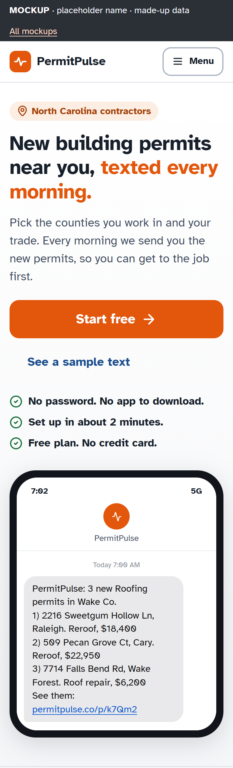
Sign in, code entry, trade pick, area pick, delivery pick, read-back, my alerts, an alert’s detail, the digest email, the SMS, and the landing page. Each is a static mockup with design notes, and each was screenshotted for review. Four of them are shown on this site. The landing page’s pricing section is cropped out because the tiers are still a proposal.
The name
There is none. The mockups use a placeholder.